
Top 5 evidence-backed “above the fold” optimizations
Implement these easy-to-make changes today and see the positive impact
7/13/20254 min read
Crafting high-converting Landing Pages: Five proven tactics
Landing page optimization is both an art and a science. To truly move the conversion needle, you need to transcend generic advice and reimagine user experience through a strategic, evidence-driven lens. Here’s how today’s most effective digital brands win buyers’ trust and guide them to action through nuanced, human-centric design.
Instill confidence with prominent trust signals and returns policy
The core obstacle for online shoppers is often risk, rather than price or selection. Without trust, visitors hesitate, second-guess, and leave without buying. Making your trust signals such as reviews, guarantees, and returns policies unmistakably visible in the header directly counters this fear. Research shows 84% of consumers treat online reviews on par with word-of-mouth, underscoring the power of social proof.
What the data says
A lenient returns policy is a revenue driver: 86% of surveyed shoppers agree it directly impacts their willingness to buy.
Brands using sizing and recommendation tools see 80% lift in conversions.
BlackMilkClothing’s transparent 60-day return stance is a real-world example of policy as a confidence builder.
Action steps
Audit your trust elements and highlight reviews, satisfaction guarantees, and security seals.
Relocate your most influential signals to the site’s header for instant visibility.
Build a clean, subtle trust bar or badge row into your navigation.
Optimize for mobile, ensuring trust cues never disappear on smaller screens.
Regularly A/B test both placement and content.
Monitor bounce rate, time on page, and conversion rate closely.
Personalize above-the-fold content by audience segment
Generic messaging is ineffective in today’s digital environment. When users recognize themselves in your offer because content adapts to their location, device, or traffic source, they become immediately more invested. This takes advantage of the self-reference effect, meaning people pay more attention to information that feels personal and relevant.
What the data says
Personalized calls-to-action (CTAs) convert at twice the rate of standard ones.
Dynamic content increases email conversions by 13 percent.
Full-funnel personalization can drive conversion uplifts as high as 260 percent, with some cases exceeding 500 percent.
Action steps
Identify segmentation levers such as location, traffic source, device type, and referral origin.
Write bespoke headlines and CTAs for each priority segment.
Use tools like Optimizely, Unbounce, or custom code to enable dynamic content swaps.
Map paid ads or campaigns to tailor landing page variants.
Roll out geo-targeted messaging.
Conduct A/B tests against non-personalized content and analyze conversions by segment.
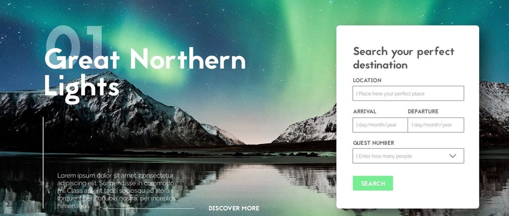
Direct attention with smart visual cues to your primary CTA
Web users rarely read; they scan for cues. Visually signposting the next step, your CTA, streamlines decision-making and anchors focus in the right place. Eye-tracking studies confirm that users scan rather than read, making visual guidance critical.
What the data says
Social proof and eye-catching CTAs can increase conversion rates by around 68 percent and click-through rates by 42 percent.
Over half of viewing time is spent above the fold, where elements are viewed more than twice as much as just below.
Action Steps
Analyze your current visual hierarchy using heatmaps.
Use arrows, lines, or images with subjects looking toward your CTA.
Ensure your CTA button and visual guides use bold, high-contrast colors.
Incorporate gentle animations such as subtle movement or blinking that attract attention without distraction.
Select hero images where models’ gaze or body language directs users toward your offer.
A/B test variations with and without visual cues.
Use heatmap tools to verify user attention is focused appropriately.
Position micro-qualifier statements by your CTA
Not every visitor is a good fit for your offer. Micro-qualifiers act as filters and amplifiers, helping ideal customers self-identify while increasing psychological commitment. This reduces low-quality leads and improves conversion quality.
What the data says
Clarifying offer relevance near CTAs improves both click-through rates and conversion quality.
Personalized CTAs convert 42 percent more viewers than generic ones.
Commitment and consistency bias means people who identify with qualifiers are more likely to follow through.
Action steps
Define your ideal customer clearly.
Create concise qualifier statements such as "For agencies booking $20,000+ in monthly sales."
Test both positive qualifiers ("For experts") and negative ones ("Not for beginners").
Experiment with placement above, beside, and below the CTA.
Compare quality and conversion rates of qualified versus unqualified leads.
Use lead scoring to evaluate qualification changes.
Refine qualifier language continuously based on results.
Deploy interactive exit-intent micro-interactions above the fold
Exit-intent technology intercepts visitors just before they leave, offering a last chance to convert. Placing these interactions above the fold increases visibility, making them less likely to be missed compared to traditional pop-ups positioned further down.
What the data says
Exit-intent pop-ups recover 10 to 15 percent of visitors about to abandon.
Some clients have increased conversions by 300 percent using tailored exit overlays.
Loss aversion motivates people to act; they respond more to avoiding loss than to potential gain.
Action steps
Select an exit-intent tool such as OptinMonster, Sumo, or Unbounce.
Design non-intrusive, visually seamless micro-interactions like sliding bars rather than disruptive modal windows.
Craft time-sensitive offers such as flash discounts or exclusive content.
Ensure above-the-fold placement for immediate visibility.
Adapt exit-intent triggers for mobile devices using scroll behavior.
Limit the frequency users see these interactions to avoid annoyance.
Track recovery rates and user experience impacts.
A/B test different offers and messaging.
Implementation priorities and success factors
Recommended sequence
Add or improve trust signals for immediate impact.
Layer in visual cues to enhance focus and engagement.
Test and refine micro-qualifiers for higher lead quality.
Invest in personalized content for long-term conversion growth.
Use exit-intent tools as a last-ditch effort to recover abandoning visitors.
Keys to ongoing success
You should run A/B tests before making final decisions.
Prioritize mobile optimization for every tactic.
Focus on preserving a positive user experience rather than aggressive selling.
Use analytics data to guide optimizations systematically.
Embrace continuous iteration to keep improving performance.
By implementing these research-backed strategies in a human-centered way, your landing pages will build trust, enhance relevance, and guide visitors towards conversion more effectively than ever before.
Grow your customers
Boost your conversion rates and increase sales. Optimize Rate is the best conversion optimization agency that helps businesses like yours to improve website conversion.
© 2025. All rights reserved.